 by Jan Oskar Engene, 29
April 2002
by Jan Oskar Engene, 29
April 2002Granted on 16 December 1938.

Last modified: 2013-07-29 by zoltán horváth
Keywords: hammerfest | polar bear | soroysund | boats (3) |
Links: FOTW homepage |
search |
disclaimer and copyright |
write us |
mirrors
 by Jan Oskar Engene, 29
April 2002
Granted on 16 December 1938.
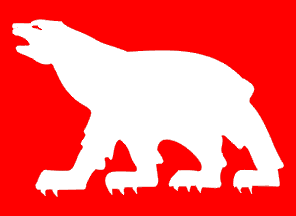
The arms of Hammerfest, a silver polar bear on a red field, were prepared for
the celebration of the 150th anniversary of the town's foundation in 1939. The
arms, which were recently redrawn by heraldic artist Arvid Sveen, were adopted
by Royal resolution of 16 December 1938. However, the image I have made is made
with an older version as the model. According to [cjo87]
the idea of the arms is to show the importance of hunting Arctic resources had
to the town. The flag corresponds to the arms, that is, a white polar bear on
red.
Jan Oskar Engene, 29 April 2002
Official blazon in Norwegian: "En hvit isbjørn i rødt."
Blazoned in English: "Gules a polar bear passant argent."
English blazon by Joe McMillan, 30 July 2002
Normally passant means the right forefoot is off the ground; statant would
mean all four feet on the ground with the two front feet together. This bear
(like most polar bears) clearly doesn't care about abiding by such rules.
Joe McMillan, 30 July 2002
Official blazon in Norwegian: "I blått tre sølv båter, 2-1."
Blazoned in English: "Azure three boats argent two and one."
English blazon by Joe McMillan, 30 July 2002
 by Jan Oskar Engene, 27 April
2002
Granted on 8 June 1979.
"In blue three white boats, two over one." This is the brief, and it might be added after looking at the drawing, not wery precise blazon of the flag of Sørøysund municipality in Finnmark County as found in the Royal resolution dated 8 June 1979. Given the long coast and the maritime traditions of Norway, the boat is a popular heraldic charge in the country's civic heraldry. The problem is, naturally, that there are so many different types of boats and that whereas the official blazons tend to speak only of "boats" the municipality and the heraldic artist usually have a specific type of boat in mind. This is also the problem with the arms and flag of Sørøysund which only speaks of boats. Some more details should perhaps have been provided in the blazon for the boats to be accurately drawn. In the case of Sørøysund, according to [cjo87], the charge was repeated three times to reflect the fact that the municipality is made up of three islands.
As of 1 January 1992 Sørøysund was merged into Hammerfest municipality.
This is why Sørøysund is not listed in [sga95]. It is found in [cjo87].
Jan Oskar Engene, 27-28 April 2002
Shouldn't the boat at the bottom be as big as the two boats at the top?
Mark Sensen, 27 April 2002
Well, a rule of heraldry is that the charges should fill out the field. That
is why I made the bottom boat bigger, so as to fill some of that blue
"empty" space in the lower part of the flag. The same is done to many
other Norwegian flags and arms.
Jan Oskar Engene, 28 April 2002
While this rule exists, I've noticed in Norway it gets a higher priority than in the rest of the world. In an example of this, with three equal charges 2:1 :
In Norway first "Filling the field." is applied, saying the bottom charge should be wider, and then the "Similar charges, similar shapes." saying the upper two charges should be equal in shape.
Elsewhere one would first apply "Similar charges, similar shapes.", which would give the bottom charge the same ratio as the upper charges, and then "Filling the field", which would mostly determine the placement and size of the charges. Indeed, this order is the reason why "round" charges are placed 2:1, as this is how three such similar shapes would fill the field best.
It's this sort of distinction that should warn us not to speak too lightly of
"Heraldry" asif its rules are universal throughout the world. The fact
that in some ways they aren't is what gives each country its own recognizable
heraldic style.
Peter Hans van den Muijzenberg, 1 May 2002