
Last modified: 2014-12-20 by zoltán horváth
Keywords: ecuador |
Links: FOTW homepage |
search |
disclaimer and copyright |
write us |
mirrors
See also:
See also:
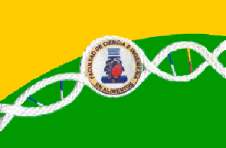
image by Ivan Sache, 07 November 2011
The "Faculdad de Ciencia e Ingeniería en Alimentos" (FCIAL - Faculty of Food
Science and Engineering) is part of the "Universidad Técnica de Ambato" (Ambato
Technical University), organized on 14 April 1969 in Ambato by State Law No. 5.
FCIAL was founded on 18 November 1963 as the "Escuela Técnica Industrial"
(Industrial Technical School), part of the "Instituto Superior de Contabilidad y
Gerencia" (Higher Institute of Accounting and Management). On 14 April 1969, the
institute was transformed into the "Universidad Técnica de Ambato" and the
school became the "Facultad de Ingeniería Industrial" (Faculty of Industrial
Engineering), with two schools, "Escuela de Tecnología en Cuero y Caucho"
(Leather and Rubber Technological School) and "Escuela Técnica de Alimentos"
(Food Technical School). On 23 May 1974, the "Facultad de Ingeniería Industrial"
was renamed "Facultad de Ingeniería" (Engineering Faculty).
On 18 October 1974, the "Facultad de Ingeniería" was divided into three schools,
"Escuela de Ingeniería en Alimentos" (School of Food Engineering), "Escuela de
Ingeniería Civil" (School of Civil Engineering) and "Escuela de Ingeniería
Agronómica" (School of Agronomic Engineering). On 21 March 1984, the "Escuela
de Ingeniería en Alimentos" was transformed into the "Facultad de Ciencia e
Ingeniería en Alimentos".
Source:
FCIAL website
The flag of FCIAL, as shown graphically on the faculty's website, is "slightly
heterodox". It is divided yellow-green by an ascending curve line, paralleled by
a white DNA molecule encircling the seal of the faculty. "Indian maize yellow"
represents the sun's photic energy and light, which allow the development of
life on our planet. "Olive green" represents vegetation and ecosystemic
development, symbolizing the different (vegetal, microbial, animal and human)
components of life.The curved line represents a section of planet Earth. The DNA
molecule is at the origin of all kind of life. The central loop in the molecule
represents the dissociation of the two-stranded molecule to allow its
duplication, and therefore the emergence of new life. This dissociation is at
the origin of Food Engineering, as a cosmic projection represented by the emblem
of FCIAL.
The emblem of FCIAL is made of an orange apple placed inside a gray gear wheel,
the whole over a blue and white erlenmeyer flask.The apple is a generic
representation of food, standing here for food science. The erlenmeyer flask
represents science; the blue color represents water that initiates and maintain
life on our planet. The erlenmeyer specifically represents training and research
performed in laboratories.The gear wheel represents engineering, machines,
technology, and devices.
Source:
http://fcial.uta.edu.ec/index.php?option=com_content&view=article&id=93&Itemid=106
Ivan Sache, 07 November 2011
Instituto Educacional Miguel Ángel Suárez, located in Loja, is named for his
founder, the teacher Miguel Ángel Suárez Rojas (1906-1987). The boarding school
San Luís was established on 1 October 1946 by Miguel Ángel Suárez, with the
support of His Grace Jorge Guillermo Armijos Valdivieso, Episcopal Vicar of
Loja, in the annexes of Colegio La Dolorosa. The school was renamed Centro
Educacional Particular de Instrucción Primaria Mariana Córdova de Sotomayor by
Ministerial Resolution No. 10 of 10 February 1949; the new name was a tribute to
the defunct wife of Ángel Sotomayor, the benefactor who had offered a house to
relocate the school. The current name of the school was prescribed by
Ministerial Agreement No. 17 of 25 November 1971, as a tribute to the 50 years
dedicated by Miguel Ángel Suárez to education.
After the death of its founder, the management of the school was transferred by
His Grace Santiago Fernández García to the Dominican Daughters of Our Lady of
Nazareth, a congregation established in Colombia on 25 March 1938 by María Sara
Alvarado Pontón (1902-1980), recognized in 1964 by the Dominican Order and in
1975 by the Holy See. It was decided to keep the name of the school to
perpetuate the founder's memory.
The flag of Instituto Educacional Miguel Ángel Suárez is white with the school's
coat of arms in the middle. White is a symbol of the purity and innocence of the
alumni, and of the transparency of the institute.
The coat of arms of the school, designed in 1946 by Miguel Ángel Suárez, has the
"classical shape of Spanish shields". The writing in the red-blue bordure was
amended in 1948 and 1972 to reflect the respective change in the name of the
school. The shield features a torch as a symbol of progress, raised by a hand
issuing from a tricolor flag, as a symbol of the Ecuadorian identity. The torch
ends with a cross, which is a symbol of the Christian faith and spirit. The
shield also features a book and a sphere as the symbols of culture and science,
respectively, a lyre, as a symbol of music, and a painter's palette, as a symbol
of arts. In the base of the shield, the branches of laurel and olive represent
triumph and peace, respectively.
Source:
http://institutoeducativomas.es.tl/Simbolos.htm - Institute's old website
The coat of arms featured on the flag in actual use is quite different from its
drawing shown on the institute's website. It has a red-blue bordure (plain white
on the drawing) fimbriated in golden yellow and a different writing ("INST.
EDUC." instead of the complete words, and "LOJA" instead of "LOJA ECUADOR" - the
rest of the writing is not visible on the photo ).
Source:
https://www.facebook.com/198918453545003/photos/pb.198918453545003.-2207520000.1415442035./288951797875001/
Photo:
http://www.miguelangelsuarez.edu.ec/t - Institute's website
Ivan Sache, 10 November 2014
The other side of the arms can be seen
here (left on this photo). Rest of the text is other part of the Institute's
name. MIGUEL ÁNGEL is written at the top, and SUAREZ on this side.
Zoltan Horvath, 10 November 2014
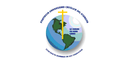
image by Ivan Sache, 2 June 2004
PUCESD is Pontificia Universidad Catolica del Ecuador - Seat
of Santo Domingo de los Colorados, that is the Faculty of the
Pontifical Catholic University of Ecuador in Santo Domingo de los
Colorados. The PUCESD was created upon request by Mgr Emilio
Lorenzo Stehle, who already created in 1991 an Instituto Superior
de Pedagogia. The PUCESD was inaugurated on 6 April 1998.
The flag of the PUCESD is white with the emblem of the University
placed in the middle. The picture shown on the PUCESD website
seems to be a close-up of the emblem, therefore I have drawn the
flag with 1:2 proportion, like the national flag of Ecuador.
White stands for purity, whereas the emblem shows the union with
the principal seat of the university in Quito. It is similar ot
the emblem of the Quito seat except the motto.
The emblem of the PUCESD incudes five elements:
- a yellow cross
- a green map of south America
- the PUCESD motto in light blue
- the earth
- the name of the University and seat in blue, around the emblem.
Santo Domingo de los Colorados is the capital city of a
canton located in the province of Pichincha.
The motto of the PUCESD is: La verdad os hara libres.
Source: PUCESD
website.
Ivan Sache, 2 June 2004

image by Ivan Sache, 10 November 2014
Unidad Educativa Abdón Calderón was established in the parish of Molletura,
part of Cuenca canton (Azuay province), as the merger of Colegio Nacional Mixto
Abdón Calderón, originally established by Ministerial Decree No. 3,090 of 28
June 1982, and Escuela Primero de Enero. The institute is named for the "Child
Hero", Abdón Calderón Garaycoa (1804-1822), a symbol of valiance, courage, and
perseverance. Born in Cuenca, Abdón Calderón was the son of Colonel Francisco
Calderón, executed on 1 December 1812 by the Spaniards after the defeat of the
patriots in El Panecillo, and of Manuela de Jesús de Garaycoa y Llaguno, who
died in poverty in 1813 in Guayaquil after the confiscation of the family goods
by the colonial authorities. When the Guayaquil Revolution broke out on 9
October 1820, Abdón, aged 18, enrolled himself into the "Voluntarios de la
Patria " battalion of the patriot army ("División Protectora de Quito") set up
by José Joaquín de Olmedo. His heroic behaviour during the Battle of the Camino
Real (9 November 1820) was awarded with the rank of Lieutenant. Abdón fought in
all the battles of the liberation campaign that allowed the patriots to march
from Guayaquil against Cuenca and Quito. During the Battle of Pichincha, fought
on 24 May 1822, Abdón Calderón, hit four times by the enemy, refused to abandon
the front line where he had raised the flag of Guayaquil. Transported to Quito,
he died a few days later and was, posthumously, awarded the rank of Captain by
Simón Bolívar.
The flag of the institute is presented as horizontally divided olive
green-yellow. Green is a symbol of aspiration to a better future, while yellow
is the symbol the resources of the area.
Source:
http://abdoncalderonmolleturo.blogspot.fr/p/datos-generales.html -
Institute's website
The flag in actual, official use, however, is horizontally divided golden
yellow-olive green.
Photos:
http://abdoncalderonmolleturo.blogspot.fr/search/label/ABANDERADO%202012
http://abdoncalderonmolleturo.blogspot.fr/search/label/ABDON%20CALDERON%20INAUGURACION%20AÑO%202012-2013
Ivan Sache, 10 November 2014

image by Ivan Sache, 11 November 2014
Unidad Educativa Bolívar, located in Ambato (Ambato Province) was originally
established on 27 April 1861 by the National Convention, as Colegio Nacional
Bolívar, then composed of the four Chairs of Latin Studies, Philosophy,
Humanities, and Religion.
The flag of the institute is horizontally divided red-black. Red is a symbol of
passion, valiance, energy, and power of the youth. Black is a symbol of
seriousness, tranquillity, and nobleness. The two colours express together the
harmony required for the human development. The history of the flag and the name
of its designer have been "lost in the mists of time".
Source:
http://colegiobolivar.edu.ec/u-educativa/simbolos-institucionales/bandera/ -
Institute's website
Ivan Sache, 11 November 2014
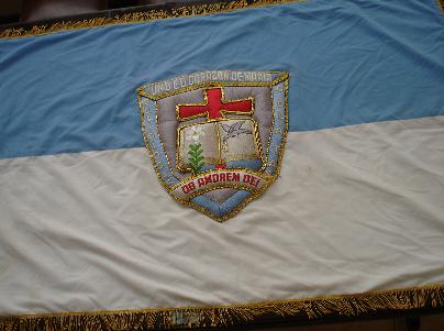
"Unidad Educativa 'Corazón de María'", located at
Cuenca, is run by the nuns of the Congregation of the Oblate
Nuns.
The congregation was founded in Cuenca by Father Julio María
Matovelle. Mother Leticia de Jesús Célleri, Superior General of
the congregation, commissioned Noemí Gárate Espinoza to found
an educative institute, which was recognized by Ministerial
Decree No. 1099 on 30 September 1959. The institute was named
after the patron of the congregation, the Heart of Mary.
The flag of the institute, according to the photo and the description
available on the website
of the institute, is horizontally divided light blue-white
with the emblem of the institute in the middle. The colours of
the flag are the traditional Marian colours.
On the flag, the emblem of the institute is a blue shield with a
white open book (as the symbol of the future opened by science)
charged with a white lily (on the left page, as the symbol of the
good souls) and a dove (on the right page, as the messager of
peace), supported by a red cross. The shield is surrounded by a
blue border, charged on top with the white writing "UND ED
CORAZON DE MARIA". A white scroll on the base of the shield
bears the Latin congregation's motto in red letters "OB
AMOREM DEI" (For the love of God). There is a golden fringe
around the flag.
The emblem of the institute, as shown graphically on the wesbite
of the institute, seems to be a modernized version of theemblem
shownon the flag.
Ivan Sache, 8 February 2009
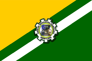
image by Ivan Sache, 12 November 2014
Unidad Educadiva Cristiania New Life is located in Quito, Guamaní sector.
The flag of the institute is in proportions 2:3, divided golden ochre-dark green
by a dark green-white ascending diagonal stripe. The institute's emblem is
placed in the middle of the flag.
Yellow is the heraldic symbol of honour, loyalty and strength. It represents joy
of the children, energy of the youth and the values of intelligence and
knowledge taught to the students. White represents peace and the purity of the
Christian principles that found the institute's philosophy. It also represents
the innocence of the children, the kindness of the teachers, and the safety of
the community. Green represents growth, hope and harmony.
The emblem of the institute features:
- a white, nine-cogged wheel outlined in dark green, symbolizing energy and work
and alluding to the origin of the institute. The nine cogs represent the fruit
of the Spirit, according to the Epistle to the Galatians, 5: 22-23: "But the
fruit of the Spirit is love, joy, peace, forbearance, kindness, goodness,
faithfulness, gentleness and self-control. Against such things there is no law."
- a yellow ring symbolizing the eternal principles of the Biblical teachings.
- a computer, surrounded, clockwise, by an inkpot and quill, a globe, a
microscope, a drawing board and a pair of compass. These tools represent the
constant quest for academic excellence, supported by advances in science and
technology.
Source:
http://www.newlife.edu.ec/inicio/nuestros-simbolos.html - Institute's
website
Ivan Sache, 12 November 2014
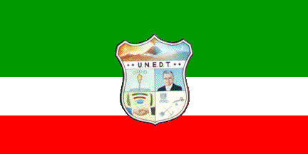
image by Ivan Sache, 11 November 2014
The flag of Unidad Educativa a Distancia de Tungurahua is horizontally
divided green-white-red (2:1:1) with the institute's emblem in the middle.
Source:
http://www.uned-tungurahua.edu.ec/index.php?option=com_content&view=article&id=5&Itemid=12
- Institute's website
Ivan Sache, 11 November 2014
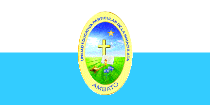
image by Ivan Sache, 12 November 2014
Unidad Educativa Particular de La Inmaculada, located in Ambato (Tungurahua
Province), is managed by the Sisters of the Divine Providence, a congregation
established in 1767 by Blessed Jean-Martin Moyë (1730-1793, blessed on 21
November 1954 by Pope Pius XII). The Sisters of the Divine Providence founded
their first school in Ambato in 1881. Colegio de La Providencia, approved by
Resolution No. 218 of 4 October 1941, was renamed Colegio de La Inmaculada in
1963.
The flag of the institute is horizontally divided white-celestial blue, with the
institute's seal in the middle. The flag's hoist shall be coffee brown.
Source:
http://lainmaculada.edu.ec/web/pagina.php?id=2&id1=10&id2=22&submenuheader=6
- Institute's website
The seal of the institute, adopted on 11 May 2007, was designed by Sister Enma
Astudillo, Director of the institute. It is made of a yellow oval inscribed with
the institute's name and place, containing five elements:
- in the upper right part, a yellow, five-pointed star representing Mary
Immaculate;
- in the middle, a coffee brown cross representing Christ Redemptive;
- in the lower left part, a bronze brown oil lamp, symbolizing faith and
science;
- at the lower right base of the cross; the Bible, with white pages and a brown
cover, symbolizing the Gospel;
- in the lower right part, a whitish iris representing the Divine Providence,
the institute's spirituality.
Source:
http://lainmaculada.edu.ec/web/pagina.php?id=2&id1=10&id2=12&submenuheader=6
- Institute's website
Ivan Sache, 12 November 2014

image by Ivan Sache, 12 November 2014
Unidad Educativa Pelileo is located in Pelileo Canton (Tungurahua Province).
Colegio Femenino de Señoritas Pelileo was established by Ministerial Decree No.
2,890 of 22 September 1978, published on 3 October 1978 in the Official
Register, No. 634, with classes in Physics and Mathematics, Chemistry and
Biology, Social Sciences, and Accounting. Instituto Técnico Superior Pelileo was
established by Ministerial Agreement No. 55 of 6 October 1994. Instituto
Tecnológico Pelileo was established by Agreement No. 113 of 28 July 2003.
The flag of the institute is horizontally divided dark red-white-gray.
Source:
http://unidadeducativapelileo.blogspot.fr/p/simbolos.html - Institute's
website
Ivan Sache, 12 November 2014
"Unidad Educadiva San Felipe Neri" (UESFN) was
founded at Riobamba by the Society of Jesus. On 13 October 1836,
President of the Republic Vicente Rocafuerte appointed Dr. J.
Véloz "Rector del Colegio Nacional de San Felipe
Neri"; however, the effective foundation date of the
institute is considered to be 25 April 1838. "Colegio San
Felipe Neri" was transformed into "Unidad Educadiva San
Felipe Neri" by the Ministry of Education on 21 September
2000 (Decree No. 931). The institute is named after St. Philip
Neri (1515-1595, canonized in 1622), an Italian priest and
mystic, founder of the Congregation of the Oratory in 1575.
A photo
taken during the "Proclamación de Abanderados y Escoltas
2008-2009" ceremony shows the flag of the institute as
horizontally divided blue-white-blue (1:2:1) with the emblem of
the institute in the middle, slightly overlapping on the blue
stripes. The flag is bordered with a fringe argent.
The emblem
of the institute was adopted on 21 September 2000, when the
institute was granted its current status and name. The emblem is
made of a shield vertically divided, the left half being yellow
with seven red bends and the right half being silver with a
cauldron flanked by two wolves, all in black. The shield is
surmonted by the foundation year, "1836", in blue, and
placed on a white disk surrounded by a grey ring charged with
"UNIDAD EDUCATIVA SAN FELIPE NERI" (top) and
"RIOBAMBA - ECUADOR" (bottom), in blue letters. The
shield is presented on the website of the institute as inspired
by the arms of Ignatius of Loyola, the founder of the Society of
Jesus. On the flag, there is a clear difference between the white
and silver elements, but the colour of the writing does not seem
to be blue, but rather or.
A similar coat of arms is used by the Society of Ex-Alumni of the
Colleges of the Society of Jesus, presented on the website of
"Colegio
San Ignacio de Loyola" of Piura, Peru. Ignatius de
Loyola was born Iñigo de Oñaz y Loyola, and his arms were
"Per pale, Oñaz and Loyola". The dexter part of the
shield, "Gules seven bends gules", was the coat of arms
of the Oñaz family. The seven bends were conferred by King
Alfonso XI of Castile to the seven Oñaz brothers who faught
during the battle of Beotivar in 1321, repelling, together with a
few Basque fellows, Gascon and Navarrian troops.
The sinister part of the shield, "Argent a cauldron flanked
by two wolves rampants, all sable", was the coat of arms of
the Loyola family. The wolves, symbols of ardor to war, are
canting for the name used by the saint in his youth, Iñigo
López de Loyola ("lobo" means "a wolf" in
Spanish). The cauldron may recall the affluency of the Loyola
family.
Ivan Sache, 8 February 2009

image by Ivan Sache, 11 November 2014
Unidad Educadiva Santa Mariana de Jesús is located in Chone Canton (Manabí
Province).
The institute, named for St. Mariana of Jesus de Paredes (1618-1645; canonized
in 1950 by Pope Pius XII, Ecuador's first and patron saint), was established by
the Sisters of Santa Mariana de Jesús, a congregation founded in 1873 by Blessed
Mercedes de Jesús Molina y Ayala (1828-1883, aka the Rose of Guayas).
The flag of the institute is divided white-pink along the ascending diagonal.
White is a symbol of the virtue and purity of St. Mariana of Jesus. Pink is a
symbol of the virtue, innocence, joy, and dedication of Blessed Mercedes de
Jesús Molina y Ayala, the Rose of Guayas.
Source:
http://sites.amarillasinternet.com/santamarianadejesus/nuestros_simbolos.html
- Institute's website
Ivan Sache, 11 November 2014
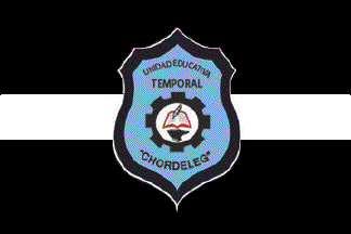
image by Ivan Sache, 11 November 2014
Unidad Educativa Temporal is located in Chordeleg Canton (Azuay Province).
The institute, established in October 1972, was nationalized by Decree No. 1,369
of 13 December 1973 and renamed Colegio Guillermo Durán Arcentales. It was
renamed Colegio Nacional Chordeleg by Decree of the Executive No. 548 of 8 April
1981.
The flag of the institute is horizontally divided black-white-black (2:1:2) with
the institute's emblem in the middle.
Source:
http://www.colegiochordeleg.com/simbolos/ - Institute's website
Ivan Sache, 11 November 2014

image by Ivan Sache, 11 November 2014
The flag of Unidad Educativa Temporal El Carmelo (Tulcán Canton, Carchi
Province) is horizontally divided blue-white-red.
Sources:
http://www.infocentros.gob.ec/elcarmelo/noticias.php?idn=45
http://www.infocentros.gob.ec/elcarmelo/imagenes/BANDEREA.jpg - Photo
Ivan Sache, 11 November 2014

image by Eugene Ipavec, 17 August 2007
pennant
image by Eugene Ipavec, 17 August 2007
The Catholic University of Santiago de Guayaquil is located in
Guayaquil. A description of the
university flag and logo, which is displayed on the flag, and
also a color photograph of the flag, can all be seen at <www.ucsg.edu.ec>.
The university flag is almost identical to the Papal
or Vatican flag, with the exception that the University Logo
is positioned where the Papal tiara and Crossed Keys are on the
Papal flag.
Ron Lahav, 17 August 2007
There's also a pennant, termed an "estandarte," on
the same page. Translated: "In the inaugural ceremony of the
main building, the archbishop monsignor Manuel de Jesús Serrano
Abad blessed the standard, that is a symbol of triangular form
with the cross of Santiago, patron of the city and school, which
expresses what the university hopes for its members: faith pure
and uncontaminated, fidelity to the traditions that it demands,
gratitude to conscience as opposed to circumstance of life. The
emblem presides over the official acts that are celebrated in the
university.
The flag, a bicolor with vertical bands of white and yellow, was
approved officially by the University Council on the 13 of June
of 1977. Since then it flies on campus every memorial day and
every Monday next to the flags of Ecuador and Guayaquil."
Eugene Ipavec, 17 August 2007
On July 31 I saw this
image
from the local newspaper
El Ciudadano showing three flags, from left to right: UFE 1,
Ecuador, UFE 2. Since the news was reported by the
newspaper in Quito, Pichincha
Province, I thought that one of the two UFE's might be of the city of
Quito, or the Pichincha
Province, but clearly it is not the case. The news was a conference by the
Ecuadorian Procurador (Ombudsman) regarding the process of money laundering in
Amsterdam, Netherlands. Then again, checked the
Amsterdam flag, and again, it does not match any of the two UFE's in the
picture mentioned above.
However, looking at the government entity mentioned in the article, Procuraduría
General del Estado (States's General Ombudsman), its symbols do not match either
of the two UFE's.
The last entity mentioned in the article is the CONCLA (Consejo Nacional contra
el Lavado de Activos, National Council Against Money Laundering), so one of the
two unidentified flags could be of this government organization, but I am not
quite sure.
Esteban Rivera, 15 August 2010
To the right, the closest thing I can come up with is maybe the flag of the
Universidad Católica de Santiago de Guayaquil. The logo of the school is located
at http://www2.ucsg.edu.ec/ and a closeup
is at http://osum.sun.com/group/ucsg.
Zachary Harden, 15 August 2010
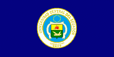
image by Klaus-Michael Schneider, 18 December 2014
President's banner:

image by Klaus-Michael Schneider, 18 December 2014
Seal:
.gif)
image by Klaus-Michael Schneider, 18 December 2014
The university was established in 1651 and has its seat in Quito but
dependencies in the country, especially also on the Galapagos Islands.
The normal dark blue outdoor flag has a ratio of approx. 1:2 with the seal
centred. The president's banner is red, divided by a blue bend sinister with the
seal centred and has golden fringes at three sides.
The seal has a golden circumscription in a white bordure fimbriated golden. The
circumscription is in golden initials "UNIVERSIDAD CENTRAL DE ECUADOR" (above)
and "FUNDADA EN 1651" (below, smaller) "QUITO" (below, slightly bigger,2nd
line). In a blue field is a rectangular "French" shield divided per fess into
yellow over green. Above is a red bonfire, fimbriated golden, lighted by four
golden stems. Beneath are a white closed book, a white pen and a white compass,
all fimbriated golden. Above the shield are 14 golden stars, either ordered in
alongside an invisible circle or oval. The shield is flanked by a white scroll
fimbriated golden with a Latin inscription In golden initials “OMNIUM POTENTIOR
EST SAPIENTIA” (wisdom is mightier than everything(?)).
Source: information provided in 2012 by E. Càceres-Tinillo
Klaus-Michael Schneider, 18 December 2014
image from university web site
Universidad San Francisco de Quito (St. Francis University of
Quito) is a Roman Catholic institution located in the capital of
Ecuador. I have received an e-mail from the Sub-Assistente en la
Oficina del Rectorado, in reply to a request for information
concerning a possible university flag, which informs me that the
logo which appears on the university
web site, has actually recently 'evolved into a squarely
shaped banner type of flag at the suggestion of one of the
Profesores who said to the Rector that because this logotipo
looks like a flag why is it not made into a flag.
Ron Lahav, 11 April 2005